P2 - PROJECT DESIGN
Rebecca Jahns, Ragna Kveli, Emma Rutherfurd, Aurora Kjevik & Juliane Bencsik
7. Oktober, 2021
ADMINISTRATIVE DETAILS

The initiator of this project is our client Carmen Perez, the founder of Idiomas por Idiotas Institute. Perez is the CEO and headteacher of the school, in addition to teaching several classes. Her vision is to make the courses offered at IDI available to anyone who might wish to learn a new language.
PURPOSE - GOALS - AUDIENCE
Our website will be the digital platform of Idiotas Por Idiomas. It offers a holistic description of the school, including all necessary information for participating in physical and online learning activities. In addition, the user has access to all means needed to get in touch with the school.
The website should primarily serve as a learning tool that provides basic language skills for everyday use. The goal of Idiomas por Idiotas is to offer a digital and interactive platform that encourages learning through gamification.
We aim to make this website suitable for anyone with a digital device, regardless of age and life situation. To summarize, the audience comprises a broad specter of people, with a desire to learn a new language as the common denominator.
NAVIGATION STRUCTURE
Generally, the website is straightforward and intuitive to navigate. We have taken several measures to reduce the number of steps and amount of time from intuition to action for the user. Consequently, the user spends less time and energy completing each task, which increases their willingness to continue interacting with the website. That is why a good navigation structure is essential to a successful website. In addition to the free and accessible structure, we have kept the number of pages to a minimum, as extra pages usually add more noise than value.
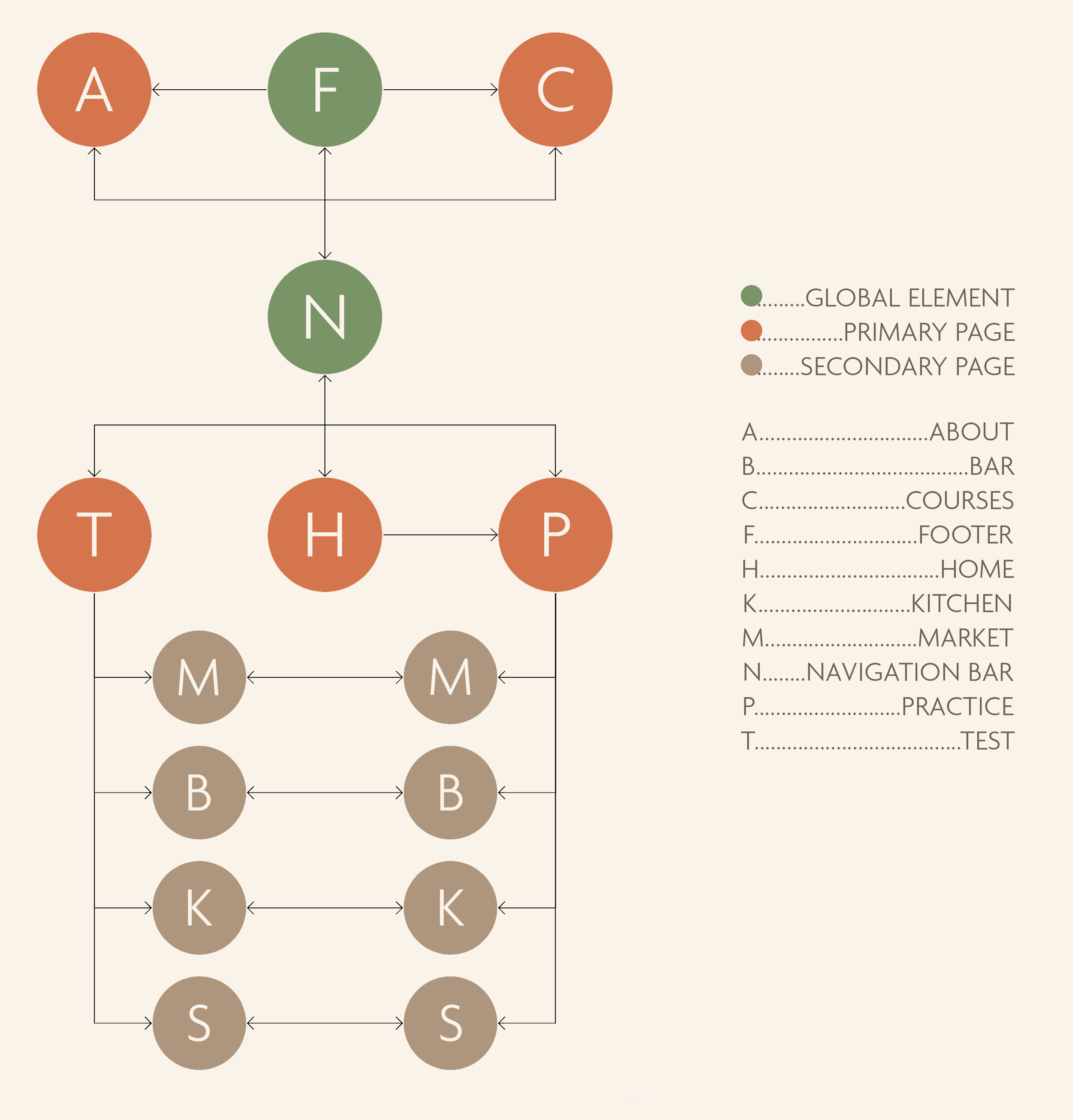
The navigation structure of Idiomas Por Idiotas is clean and concise due to the global structures - which are found on all pages within the website. The navigation bar and the footer compose the global structures. The navigation bar consists of five options that represent and link directly to the five main pages. As a result, all main pages – home, practice, test, courses, and about – can be reached at all times. This is a basic yet impactful measure to ensure effective navigation.
In addition to the main pages are secondary ones. The characteristic of secondary pages is that they cannot be reached directly from the navigation bar and must be accessed from a main page. However, thanks to the dropDownMenu.js function, our secondary pages - the practicing arenas and the vocabulary tests - are also found in the navigation bar. They still characterize as secondary due to the increased number of steps to get there. Another distinction of this website is that the secondary pages are complementary and corresponding, as shown in the illustration below.
PAGE LAYOUT & APPEARANCE
Layout
The mockup image below shows a generic page containing strictly global components. Global components are the common denominators of all pages on the website. In our case, this includes the logo, the navigation bar, and the footer, which consist of several elements.
The first common element of the website is the Idiomas Por Idiotas logo in the top left corner. The logo is visible from all pages and brings the user back to the homepage when clicked. The navigation bar is located at the top right corner of the page, making it visible and easy to maneuver. It allows the user to access all pages that make up the website. The navigation bar emphasizes which page the user is currently browsing by displaying the option in a bigger, bolder, more saturated font. Finally, a drop-down menu on the far right of the navigation bar lets the user select a default language. All mentioned features are part of the navigation bar, and they will stay fixed at the top when the user scrolls.
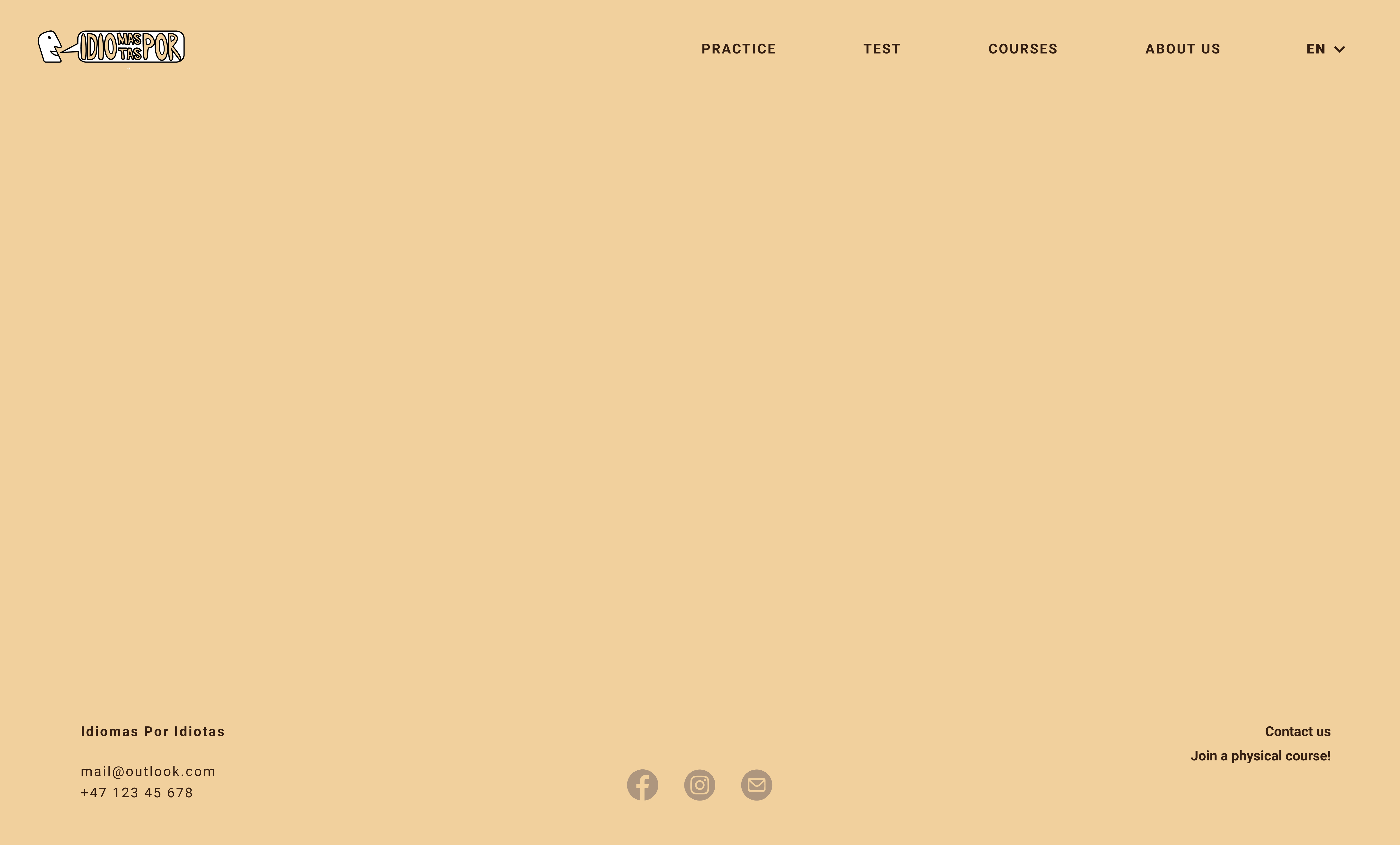
The footer is located at the very bottom of all pages. It contains contact info, social media links, and two references to convenient pages that are not immediately visible in the navigation bar. The former brings the user to the 'about us' page, where an input-form enables them to ask questions and make inquiries for Idiomas Por Idiotas - directly from the website. The latter is a crosslink to the courses site, where users can book a physical course that says 'Join a physical course!'.
The website uses two different fonts - Montserrat for headings and Roboto for body text. Headings are 50 pixels in size, and the general body text size is 18 pixels. The headings are displayed in either green or dark red color, while the body text is displayed in a super dark brown color. All hyperlinks of text and icons will change color and weight when hovering. Clickable illustrations and buttons have a subtle drop shadow to indicate they can be clicked and increase size when hovering over them.
Colors
The background color of the website is a soft yellow, with the HEX code #F1D09D. We chose colors that would aid an intuitive understanding of the purpose behind the website and the different content. We initially explored using only red and yellow tones inspired by the Spanish flag, but quickly discovered that we needed more colors to make a compelling website. The final color palette is a blend of nine different colors that contribute to an immediately warm and playful atmosphere. The nine colors are extracted from six different tones - the peachy red, the neutral brown, the cyan blue, the leafy green, and the soft yellow. There are three bright neutrals, three medium accents, and three bold darks.

Above is the result of the Figma plugin for color blindness using our current color palette. The overall score is good, and the palette seems diverse enough to tell apart no matter the color blindness. However, the Achromatopsia vision offers some challenges. Several colors are pretty similar to this color blindness, which is why the colors are carefully mapped onto the website, not to place problematic colors on top of each other. This should fulfill our usability demands, especially considering the test was already passed.
Scaling
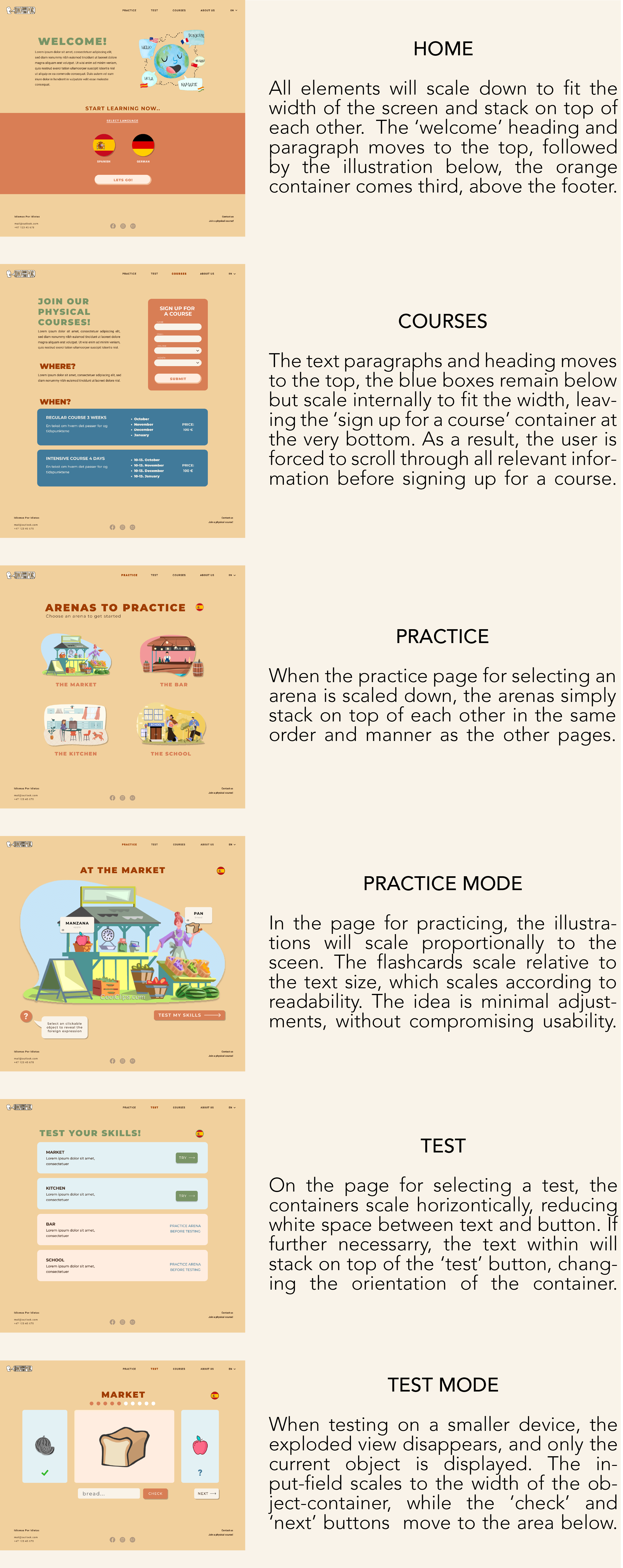
We made a flexible layout to make the website scale nicely on different devices. Entering the website using a screen different to layout default will trigger a few adjustments. Most computers and tablets will only require adjusting the amount of whitespace relative to the difference in screen size. As a result, the elements will scale while remaining in their fixed position. For smaller devices, the general idea is that elements scale to fit the screen's width and stack on top of each other in the natural reading order. Devices with vertical orientation follow the same ground rules. Below is a page-specific scaling table.
CONTENT
Home.html
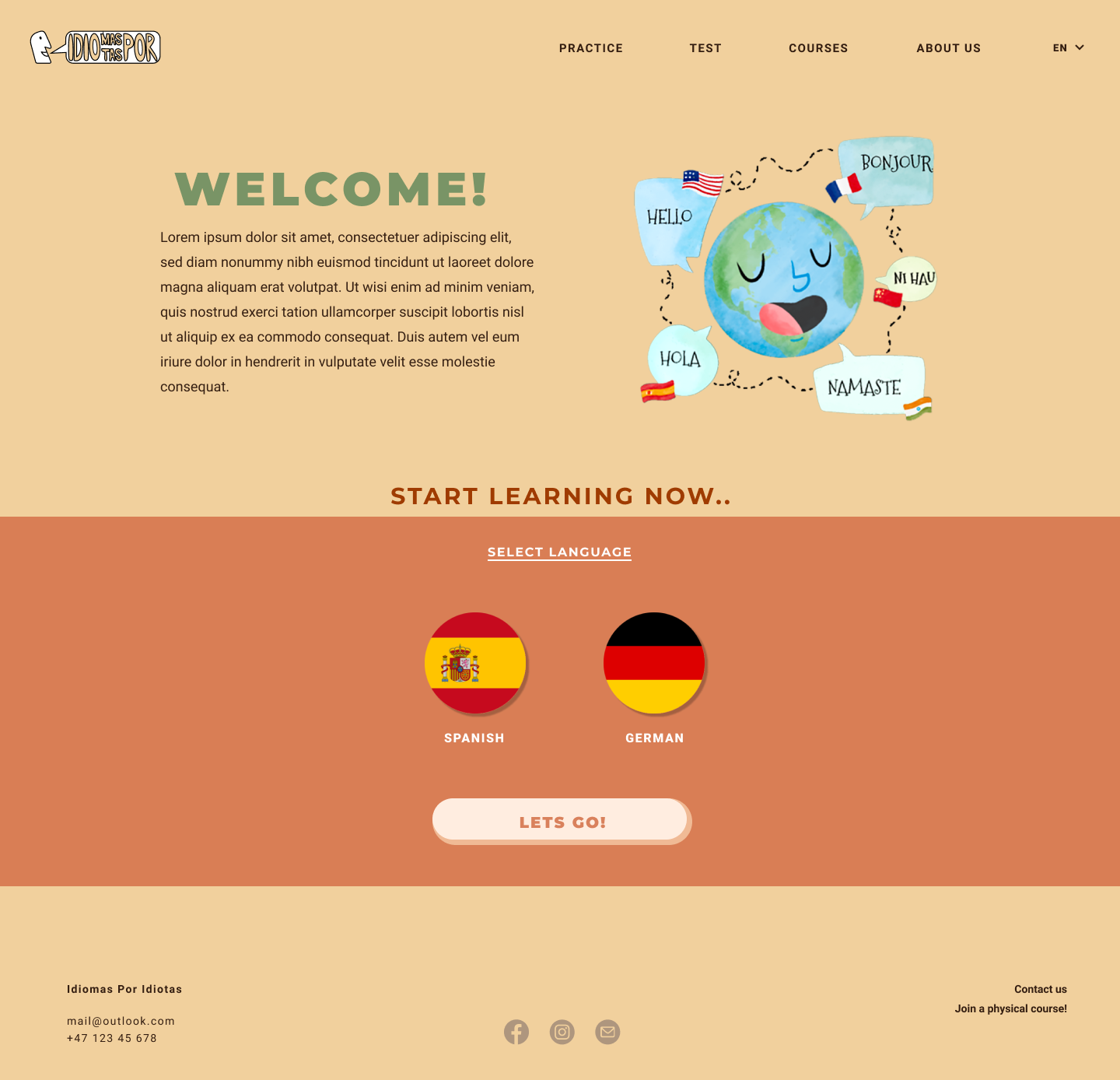
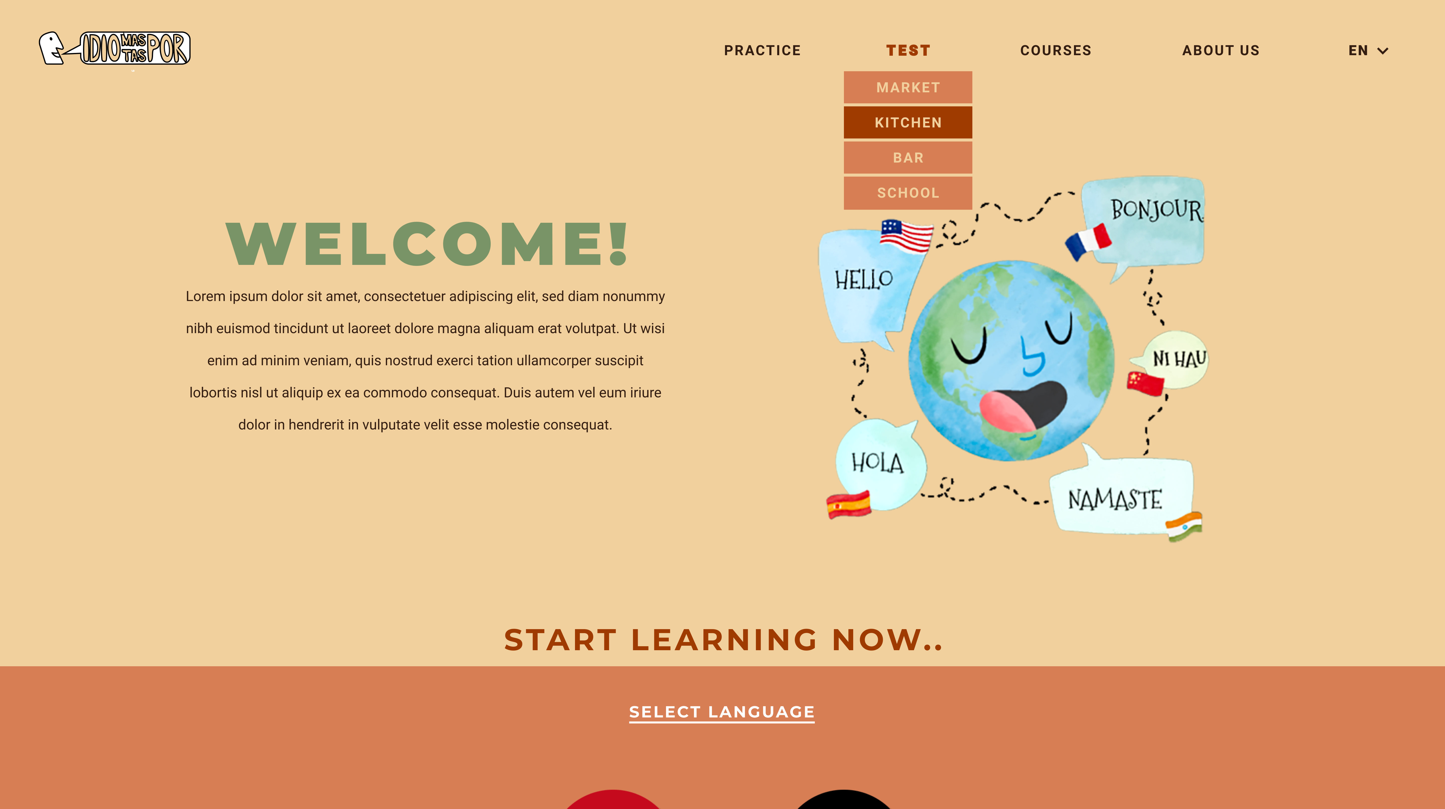
The home- or landing page is the first thing that meets the eye when visiting the website. It aims to provide a quick overview of what the website and Idiomas Por Idiotas Institute has to offer. In addition, the landing page shall serve as a warm welcome that encourages the visitor to explore the site further and participate in the different learning activities.
The first goal, to provide an overview, is achieved through a consise description of the website's purpose and the different functions. To complement the text is an illustrative drawing that provides an intuitive understanding of the site.
The second goal, to encourage exploration, is achieved by using bright and happy colors, expressive language, and imperatives. Furthermore, the lower section of the landing page is dedicated to having users test the on-site learning gamification. They simply have to select their preferred language and press' lets go!', before they are taken to the 'Practice' page for choosing an arena to play.
The landing page's layout separates from the other pages by dividing the viewport in two using color blocks. Furthermore, it has a lot more whitespace and less text in comparison, in addition to the colorful illustration. The saturated color blocks create contrast and draw attention in order to emphasize important content. This is utilized by encapsulating the section for choosing a language to get started learning from the landing page. The home page can be reached from any other page on the website by clicking the logo in the top left corner of the navigation bar.
About.html
Like the landing page, the about page is divided by color blocks, separating the contact form and -info from the rest. Generally, the about page is for users who wish to learn more about the language school or gain a deeper understanding of the concept. Beneath the heading is a graphic artwork that captures the true purpose of the school and adds a fun visual element to the page. The illustration is accompanied by an informative text consisting of two paragraphs. The former is a brief summary of the school's history and its founders. The latter describes the different offers provided by the school and website, as well as the vision and motivation behind them.

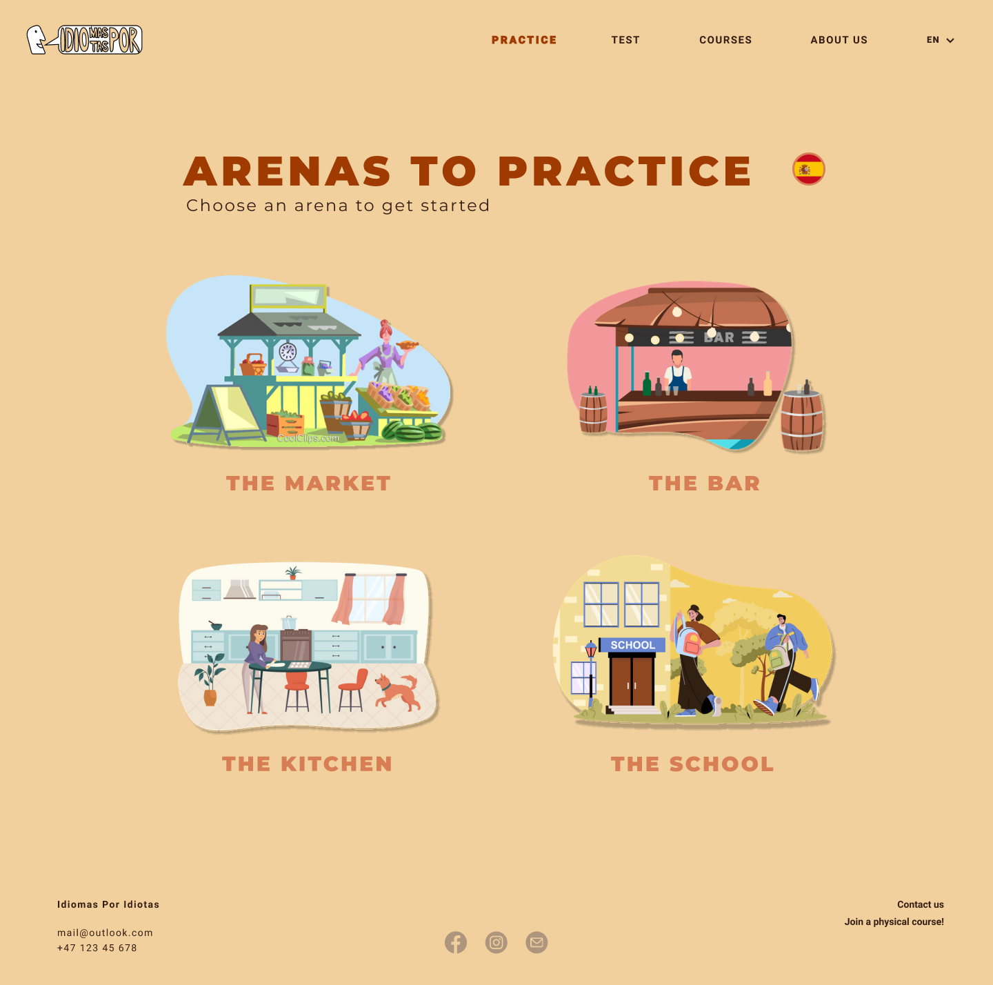
PracticeArenas.html
The goal of this page is to give an overview of the different practicing arenas available. Every arena introduces a new situation and topic, destined to accumulate in basic vocabulary for everyday use. The practice page should be easy to navigate. As for the other pages, the design is clean and intuitive. Only the necessary content and information is presented.
With illustrations as the main attribute and only a few lines of text, this page deviates from the website's general layout. The user can select a practicing arena by clicking on the corresponding illustration. When hovering over an illustration, its size increases, indicating that it is clickable. The written name of the arena is displayed below each illustration. Once an arena is selected, the user is taken directly into game mode. This reduces the number of steps from intention to action to the absolute minimum, which is a great tool for maintaining a good workflow and keeping the user interested.
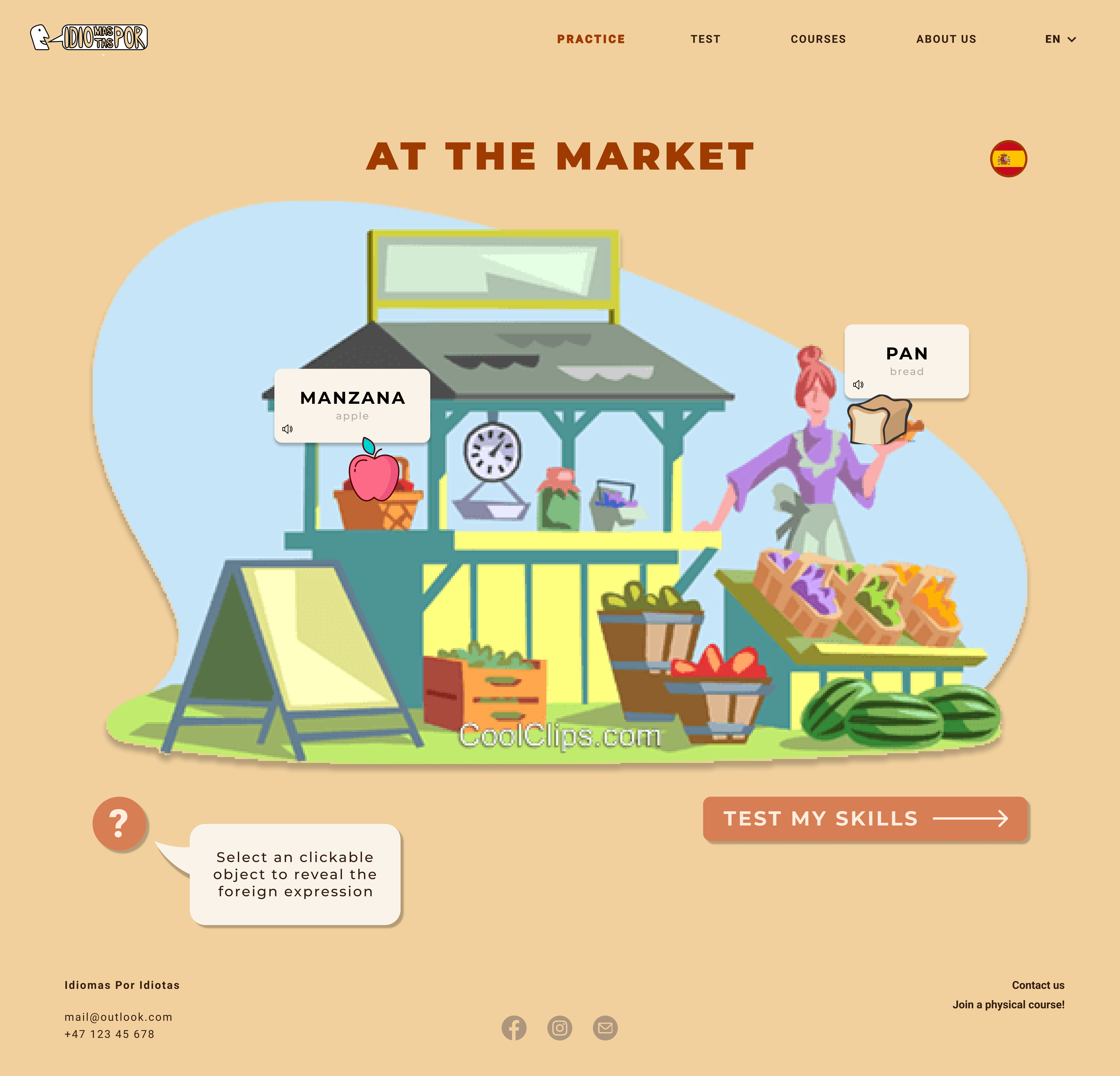
PracticeMarket.html
The goal of this page is to introduce the user to a new language through a digital and interactive platform. The page encourages learning using concepts from gamification.
On the practice page, the illustration of the chosen arena is enlarged to cover approximately 85% of the screen. Game instructions are provided in a textbox below the illustration, in the shape of a bright speech bubble. This can be closed and opened by clicking the button marked with a question mark.
The game is built on a click and reveal concept. Each arena has ten clickable objects that increase in size and visibility when hovered. The user's goal is to find these. When an object is clicked, a flashcard containing the corresponding foreign noun appears. The noun is displayed in bold text, accompanied by the less visible English translation. Once a new object is clicked, the previous flashcard disappears. The arena is completed when the user maneuvers the last of the ten objects, at which point all flashcards are revealed. After having practiced the vocabulary, the user has the possibility to click the 'Test my skills' button that takes them to the corresponding skill test.
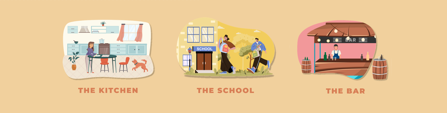
PracticeBar.html - PracticeSchool.html - PracticeKitchen.html
We will prioritize showcasing the interactive game by initially implementing one arena, 'The Market'. Furthermore, depending on the available time left, we will proceed to expand the game with three different arenas for demonstration. All arenas will eventually build on one template, using interchangeable illustrations, objects, and language. Consequently, if we decide to expand, we will change the file architecture and use JavaScript to avoid repeating code.
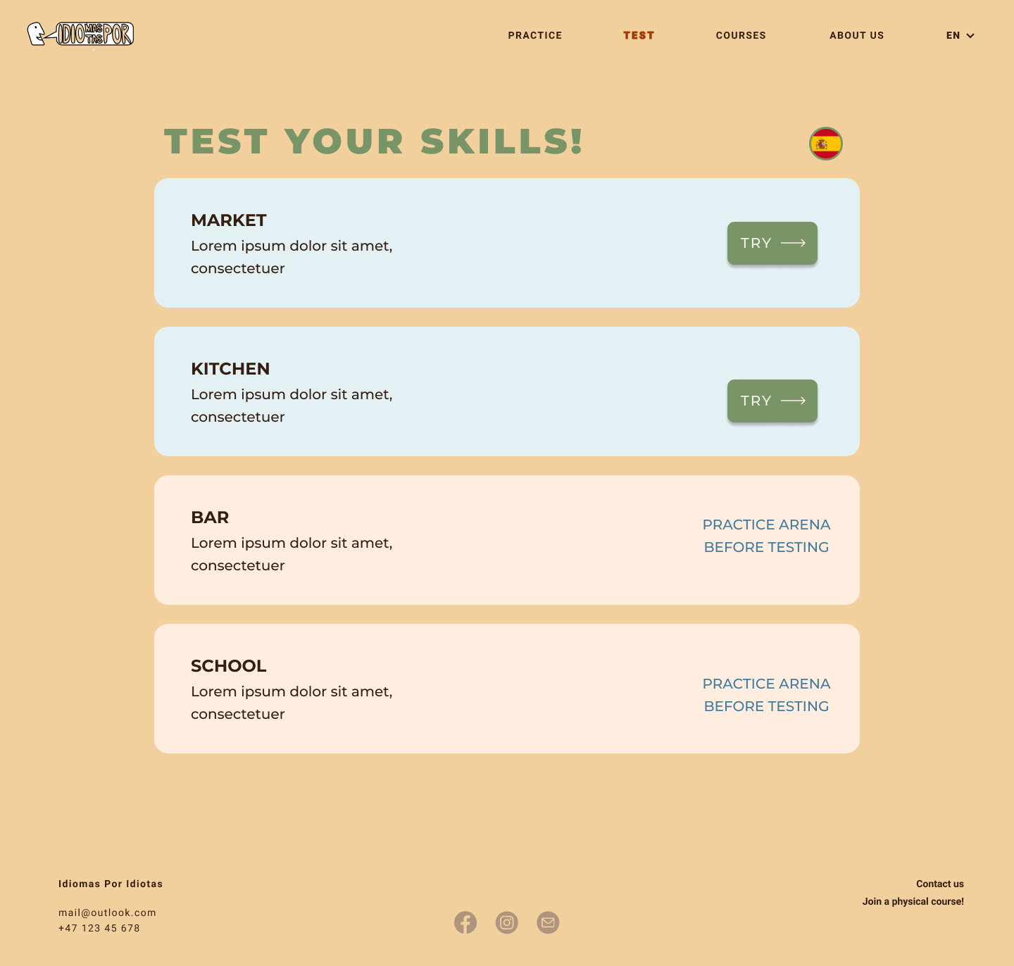
SelectTest.html
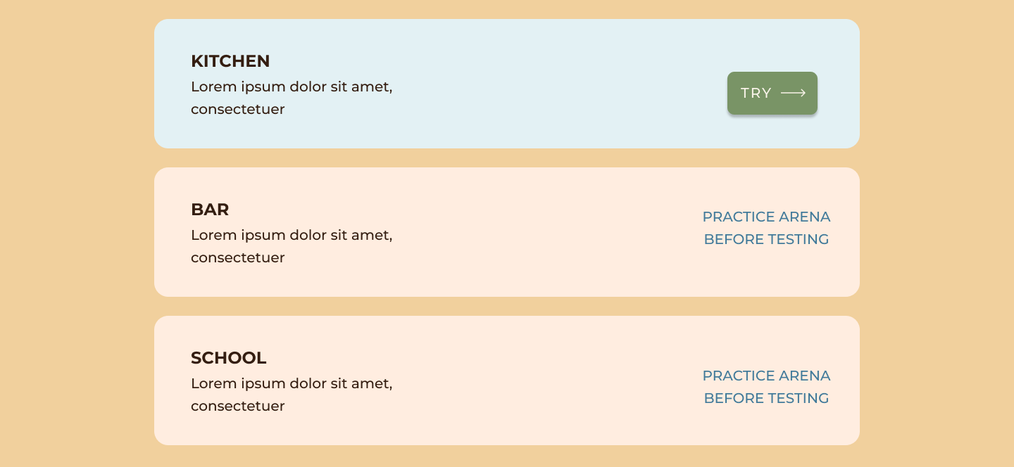
The goal of this page is to present the various vocabulary tests available to the user. They are illustrated using textboxes, that are stacked in order by the corresponding practicing arenas. Completed tests will display the previously accumulated score.
The test boxes are colored to emphasize their differences. Green boxes signify that the user can access the test, whereas red boxes signify that the test is unavailable. This is elaborated by the message "Practice arena before testing". Clicking a green box will initiate the specific test while clicking a red box will direct the user to game mode, where the practicing arena must be finished before accessing the test.
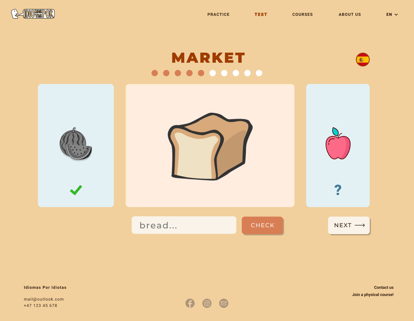
TestMarket.html
The goal of this page is for the user to test their progress with 'The Market' arena and (hopefully) get a sense of achievement. The test operates by displaying the ten different objects used in the respective arena one by one. The exercise is to name the given object by writing in the input field. The 'Check' button will reveal whether the answer is correct, while the 'Next' button will proceed to the next exercise. Feedback is given using green check symbols for correct or red cross symbols for incorrect. Both previous and upcoming objects are shown on each side of the current exercise object. These are scaled-down, and the last object is displayed in B&W. Above the exercise cards is a string of circles representing the exercises. Colored circles indicate completed tasks, and white circles indicate the remaining ones. These effects aim to provide a better overview of the user's progress during testing.
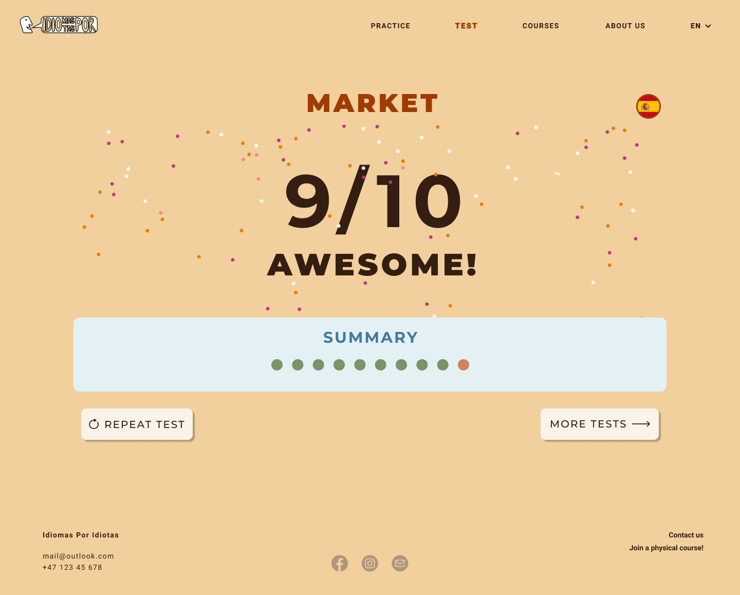
The viewport will display the test score and written feedback when a test is completed, depending on the result. This operation can be implemented on the condition that the website is responsive to user input. In addition to the written score is a viewing of the previously mentioned circles, colored in green or red to indicate correct and incorrect answers. After finishing a test, the user is presented with the option of taking another test, using a button marked 'more tests', or clicking 'repeat test' for a do-over.
TestBar.html, TestSchool.html and TestKitchen.html
Similar to the arenas, we will initially prioritize implementing only one test, 'The Market'. Furthermore, depending on the available time left, we will proceed to expand the game with the remaining three corresponding tests. All tests will eventually build on one template, using interchangeable illustrations, objects, and language. Consequently, if we decide to expand, we will change the file architecture and use JavaScript to avoid repeating code.
Courses.html
The goal of this page is to provide the user with all relevant information regarding the physical courses offered at Idiomas Por Idiotas Institute. It also offers the possibility to sign up for a course through an input form. We aim to make the page intuitive for all potential users by keeping the design simple and showing only the strictly necessary information.
Text descriptions of the courses, their content, and other details will be written in three different sections - what, where, and when. In addition, the page contains a short paragraph with instructions, found at the very top. There are two different types of courses - 'Intensive' and 'Regular'. They are represented by two separate containers in the bottom of the page, containing specific information such as durability, location and price.
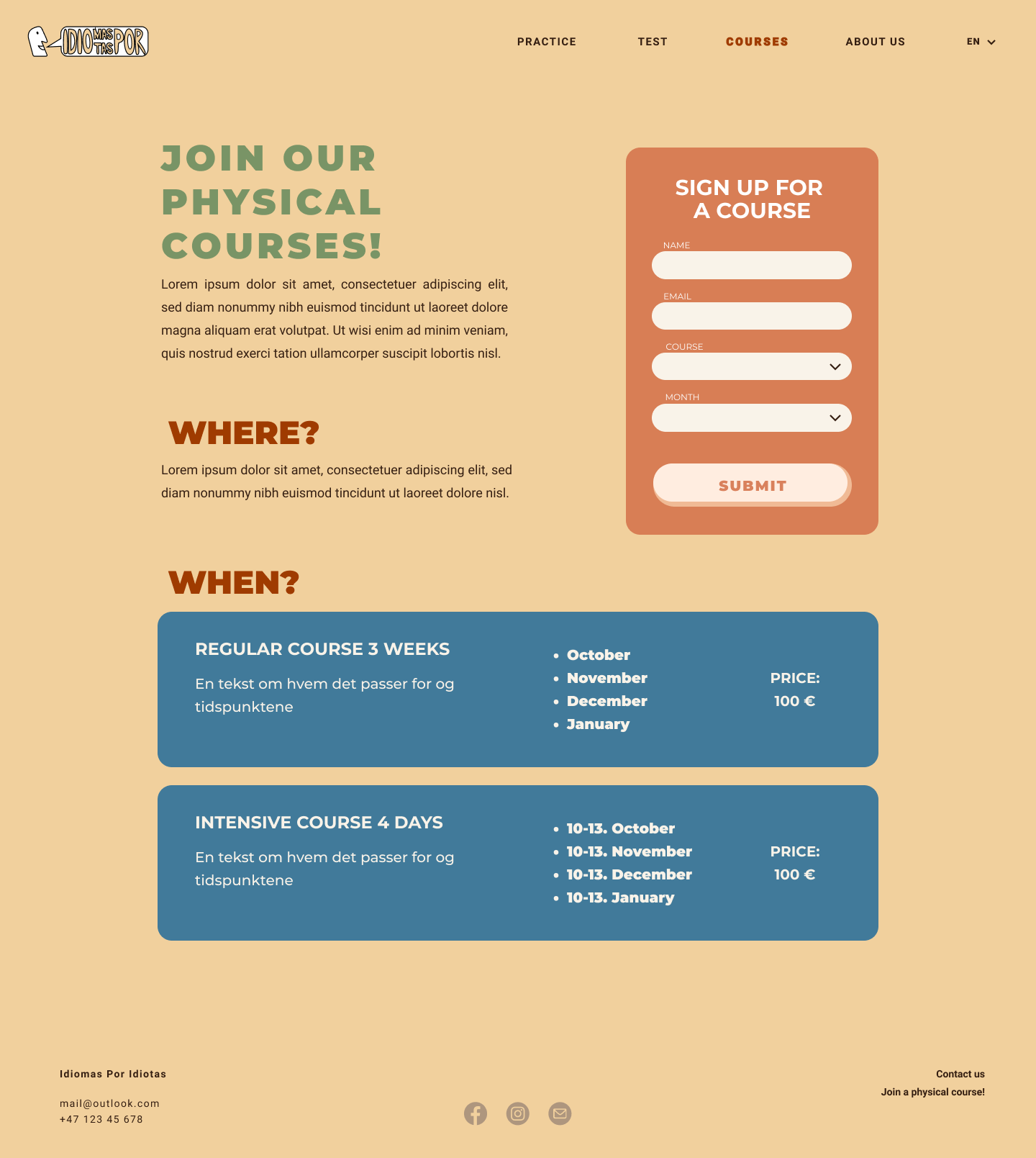
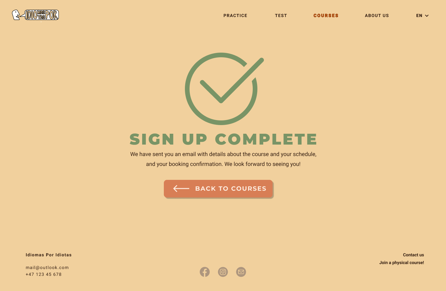
The sign-up form can be found in the upper right section of the page. It consists of bright input fields on top of a saturated orange container that attracts the user's attention. The form requests four instances of user input - name, email, course, and date, which are strictly necessary to register a booking. Again, this reduces the steps from intention to action to the absolute minimum, making it more likely for the user to comply. After typing name and email, selecting Intensive or Regular course, and choosing a convenient month to participate, pressing the 'Submit' button will complete the booking. Once this is done, the viewport will display a checkmark icon accompanied by the text 'Sign up complete' as feedback, along with a short text about the booking confirmation sent by mail. The user can go back by pressing 'back to courses', if they wish to book another course or participant. If the form is not correctly filled in or any input is missing, the page will stay static, and a red star will be displayed next to the appropriate input field.
MINIMUM REQUIREMENTS
1. dropDownMenu.js
This JavaScript function will be applied to the navigation bar's 'test' and 'practice' options. It operates by showcasing a drop-down menu that enables the user to skip directly to one of the arenas if desired. The drop-down menu will appear downwards from the option in the navigation bar when the user hovers over it. The function increases flow and effectiveness by allowing the user to practice or test without entering practiceArenas.html or testArenas.html first. This function works best for frequent visitors who know their way around the site and wish to navigate it faster.
2. flashCard.js
This JavaScript function is initially created for the practicing arenas and is the main operator behind the click and reveal concept. A flashcard containing the corresponding foreign noun appears when the user clicks one of the ten clickable objects in an arena. As the user proceeds to click new objects, the previous flashcard disappears. Once all ten objects have been clicked, all flashcards will reappear in unison for a brief moment.
3. inputCheck.js
This JavaScript function is an important part of the interactive vocabulary tests. It checks whether the answer is correct by comparing the given user input to the original solution.
4. calculatePoints.js
Similar to the latter, this JavaScript function concerns the vocabulary tests. It calculates the user's accumulated points during a test and generates feedback once it is completed. The feedback is given as a total score, accompanied by an appropriate written message.
PLAN
List of files and folders
- styling.css
- home.html
- about.html
- practice/
- practiceHome.html
- practiceMarket.html
- test/
- testHome.html
- testMarket.html
- courses.html
- images/
- logo.png
- home.png
- about.png
- practiceMarket.png
- practiceBar.png
- practiceSchool.png
- practiceKitchen.png
- confetti.png
- marketObject1.png
- ...
- marketObject10.png
- signUpComplete.png
- scripts/
- rolloverMenu.js
- calculatePoints.js
- inputCheck.js
- flashcard.js
Work division and deadlines
| Filename | Description | In charge | Deadline |
|---|---|---|---|
| styling.css | The general stylesheet for the website | Everyone | 01.11 |
| rolloverMenu.js | The menu bar | Juliane, Emma | 01.11 |
| flashcards.js | Flashcards appear in practice arena | Emma, Ragna | 01.11 |
| inputCheck.js | Checking the input in the test to know if it’s correct | Aurora, Rebecca | 01.11 |
| calculatePoints.js | Calculate points from test | Aurora, Rebecca | 01.11 |
| home.html | The homepage | Juliane | 25.10 |
| about.html | About the page and the lessons | Aurora | 25.10 |
| practiceHome.html | Practice overview page | Emma | 25.10 |
| practiceMarket.html | Practicing vocabulary | Emma | 25.10 |
| testHome.html | The test homepage, where the user chooses between different vocabulary tests | Rebecca | 25.10 |
| testMarket.html | Testing vocabulary | Rebecca | 25.10 |
| courses.html | Information and sign up for physical courses | Ragna | 25.10 |
| logo.png | The logo of the client | Rebecca | 18.10 |
| header.png | header | Juliane | 18.10 |
| home.png | The illustration on the landing page | Juliane | 18.10 |
| about.png | The illustration on the about page | Juliane | 18.10 |
| practiceMarket.png | Background arena “market” | Aurora | 18.10 |
| practiceBar.png | Background arena “market” | Aurora | 18.10 |
| practiceSchool.png | Background arena “market” | Aurora | 18.10 |
| practiceKitchen.png | Background arena “market” | Aurora | 18.10 |
| MarketObject1.png | Illustration of object 1 | Aurora | 18.10 |
| MarketObject2.png | Illustration of object 2 | Aurora | 18.10 |
| MarketObject3.png | Illustration of object 3 | Aurora | 18.10 |
| MarketObject4.png | Illustration of object 4 | Aurora | 18.10 |
| MarketObject5.png | Illustration of object 5 | Aurora | 18.10 |
| MarketObject6.png | Illustration of object 6 | Aurora | 18.10 |
| MarketObject7.png | Illustration of object 7 | Aurora | 18.10 |
| MarketObject8.png | Illustration of object 8 | Aurora | 18.10 |
| MarketObject9.png | Illustration of object 9 | Aurora | 18.10 |
| MarketObject10.png | Illustration of object 10 | Aurora | 18.10 |
| signUpComplete.png | Icon to signify complete sign up | Ragna | 18.10 |
| confetti.png | Confetti for feedback on tests | Rebecca | 18.10 |
| Testing Round 1 | User tests | Everyone | 2.11 |
| Fixing | Using the outcome from user tests to improve the code | Everyone | 6.11 |
| Testing Round 2 | User tests | Everyone | 7.11 |
| Fixing | Using the outcome from user tests to improve the code | Everyone | 9.11 |
| Final check and delivery | Reading throught the text and double checking that everything looks correct | Everyone | 10.11 |